The Psychology of UI Feedback: Why Microinteractions Matter ✨🧠
“Delight is in the details. And those details? They’re called microinteractions.” 💡
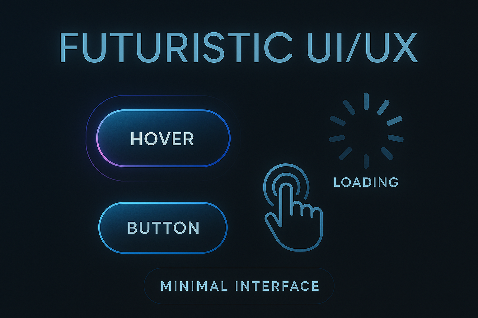
When you hover over a button and it subtly changes color, or see a tiny spinner while content loads—those aren’t just design whims. They’re microinteractions: small, purposeful UI responses that bridge the gap between human expectations and machine behavior. These seemingly minor details hold immense power in shaping how users perceive your app or website. 🌐💬
What Are Microinteractions? 🤏
Microinteractions are the small moments where the user and the interface engage in a feedback loop. These include:
- 🔘 Button animations that respond to clicks
- 🔄 Loading indicators that reduce uncertainty
- 🖱️ Hover effects that show elements are interactive
- ✅ Form validation cues (like a red border or green checkmark)
- 🔔 Notification badges
- 🎵 Sound cues for actions like sending a message
- 💥 Subtle vibrations in mobile apps on successful actions
These elements act like digital body language, non-verbal cues that say, “You’re doing it right.” While they may not change the core functionality, they dramatically influence how intuitive, engaging, and satisfying an interface feels. 😌
Why Do Microinteractions Matter? 🤔
-
They Set Expectations 🧭 Microinteractions guide users by confirming their actions. For instance, a ripple effect on a button click lets the user know, “Yes, we got your input.” This eliminates ambiguity and makes the experience more human.
-
They Reduce Cognitive Load 🧠💡 Instead of forcing users to guess, microinteractions offer immediate visual or audio responses that help users feel in control. This makes interactions effortless and speeds up decision-making.
-
They Build Trust 🤝 Ever tapped a button and wondered if it registered? Microinteractions prevent that doubt. When interfaces behave predictably, users build trust. That trust translates into longer engagement and lower bounce rates.
-
They Increase Engagement 🔥 People return to products that feel good to use. A swipe animation here, a loading shimmer there, and you’ve built a UI that rewards users every time they engage.
-
They Communicate Brand Personality 🎭 A quirky loader, playful button animation, or even the tone of a tooltip can convey your brand’s attitude. Whether you’re aiming for fun, elegant, or futuristic—microinteractions help paint that picture.
Common Microinteractions and Their Psychological Impact 🧩
1. Loading States: The Antidote to Uncertainty ⏳
Nothing is more frustrating than tapping a button and getting no response. A loading spinner, shimmer effect, or progress bar tells users something is happening in the background.
These elements reduce user anxiety, make waiting more bearable, and provide a sense of progression.
Code Example (React + CSS):
{loading ? <div className="spinner"></div> : <button onClick={handleClick}>Submit</button>}
.spinner {
  border: 4px solid rgba(0, 0, 0, 0.1);
  border-left-color: #09f;
  border-radius: 50%;
  width: 24px;
  height: 24px;
  animation: spin 1s linear infinite;
}

@keyframes spin {
  to { transform: rotate(360deg); }
}
2. Hover Effects: Invitation to Engage 🧲
Hover states create affordances. They signal to users, “Yes, this is clickable!” This is a silent invitation that guides the user toward the next step.
CSS Example:
.button {
  background-color: #007bff;
  transition: background-color 0.3s ease;
}
.button:hover {
  background-color: #0056b3;
}
3. Button Animations: Feedback in Action 🎮
A button press that slightly scales or dims gives an immediate sense of physical response. It’s like the digital equivalent of pressing a real button—tactile, snappy, and satisfying.
CSS Example:
.button:active {
  transform: scale(0.98);
  box-shadow: 0 2px 5px rgba(0,0,0,0.2);
}
4. Form Validations: Instant Course Correction 🛑✅
Seeing a red border after typing in an invalid email or a green checkmark for a valid phone number provides users with instant, valuable feedback. This reduces errors and helps guide user behavior.
5. Sound & Haptics: Reinforcing Actions 🔊📳
A click sound when sending a message or a subtle vibration after liking a post on mobile adds a multi-sensory layer to the experience. These microinteractions, though often optional, add realism and weight to digital actions.
Best Practices for Designing Microinteractions 🛠️🎯
- Keep It Subtle – Avoid loud or excessive animations that can feel gimmicky. 🚫💥
- Be Purposeful – Each microinteraction should support a user goal or offer meaningful feedback. 🎯
- Ensure Consistency – Use uniform patterns and animations throughout your product. 🔄
- Don’t Overload – Too many microinteractions can overwhelm the user and dilute their value. 🧨
- Optimize for Speed – Animations should be quick and responsive. Anything over 300ms can feel sluggish. ⏱️
- Design for Delight – Add touches of joy, especially on completed actions—like a confetti burst or a friendly “Woohoo!” 🎉
Conclusion: Microinteractions, Macro Impact 💥💡
In the world of UI/UX, it’s easy to chase big features and bold designs. But often, it’s the tiny details that whisper rather than shout which shape the user’s emotional journey. Microinteractions are your interface’s way of saying, “I see you. I’m listening.” 👀👂
These moments are the heartbeat of user experience—each click, hover, swipe, or ping adds up to a seamless story your app tells. 🎬✨
So the next time you’re polishing your UI, remember:
A well-timed hover or a soft bounce of a button isn’t just eye candy—it’s psychology in action. 🧠🎨